
One of my former professors at Etown teaches a creative nonfiction class for freshman. At the end of the semester, each student submits one piece to be added to an anthology, along with a picture that represents their story. It’s my job to organize the submissions and arrange them in the anthology, as well as design the front cover.
The process started with me visiting the class to run a brainstorm meeting. This is where I get to know the students and what the class means to them. Together, we decide on colors, fonts, design ideas, and most importantly, the title.
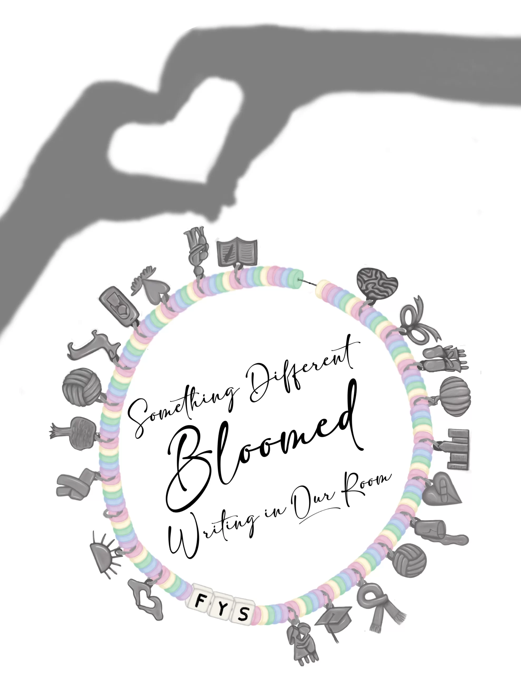
Then I took all the information I learned and started designing. The class was Taylor Swift themed, so the students decided they wanted a friendship bracelet on the cover, with each student getting a charm to represent them. They also wanted other imagery such as heart hands, so I drafted several different layouts and picked the one I liked the best.


Some of my initial sketches for the cover layout. I decided on the first one.
The Initial Sketches
My next objective was the friendship bracelet. I began by sketching out the basic shapes that I was looking for, making sure there was enough room for each student’s charm.
Then I designed the beads (one in each color), the letter beads spelling out FYS (for First-Year Seminar, the name of the class) and teeny split rings to “hang” the charms on. Then I essentially copy-pasted that around the full length of the bracelet.


Designing the Charms
The individual charm designing was challenging yet extremely rewarding. First, I got the basic shape of the charm done and placed them onto the loops of the bracelet. Once all the charms were done, I started shading. This took the longest out of everything in the project!
I wanted to recreate the metallic shine of charms, and on such tiny spaces, it was meticulous work. But I think the results are outstanding!


Once the bracelet was done, I had all of my elements together, so I arranged everything on the cover, just like my in my sketch. And that was it!

Internal Design
Once the cover was done, it was time to work on the inside. And after deciding on the style, it was as easy as copying the text into a premade template. This part of the project went much faster.


There were a few other custom elements to implement, such as mini-heart hands to separate the end of the piece from the author biography, and a filler page for pieces that ended on odd-numbered pages. For the filler page I made a silhouette of the bracelet from the cover with the course code, FYS.

Once all of the designing was done, I submitted the cover and the content to the professor who was in charge of the project, and she sent it to the publishing company. A few weeks later, I had the completed anthology in my hands!
The Final Product
This is one of my favorite things about book design, having the final project in my hands to show off my work. This project took a lot of time, but I am so happy with how it turned out, and so were all of the students in the class!

